
In today’s digital age, responsive web design is no longer optional; it is a necessity.
Responsive web design is a vital tool for Malaysian businesses. It boosts their chances of higher conversion rates.
Let’s explore why responsive web design is crucial for boosting conversions in Malaysia and how businesses can leverage it for maximum impact.
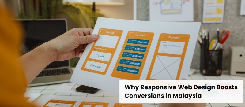
What Is Responsive Web Design?
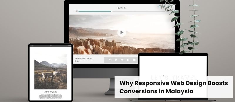
Responsive web design helps a website’s layout, images, and navigation adapt to the user’s device, whether it is a desktop, tablet, or mobile.
Instead of building separate websites for various screens, it uses:
- Fluid grids that scale with screen size
- Flexible images and media
- CSS media queries for device-specific adjustments
- Fast loading times across all platforms
Reasons Responsive Web Design Improves Conversions in Malaysia
Mobile Usage in Malaysia Is Skyrocketing
Malaysia has one of the highest mobile penetration rates in Southeast Asia. More than 90% of internet users access the web via smartphones.
A responsive design makes it easy for users to navigate. This leads to lower bounce rates and more conversions.
Better User Experience Leads to Higher Engagement
A poorly optimized website frustrates users, resulting in high bounce rates. According to Google’s research, 53% of mobile users leave a site that takes longer than 3 seconds to load.
Responsive design improves:
- Navigation ease: No zooming or horizontal scrolling.
- Readability: Appropriately sized text and buttons.
- Faster loading times: Optimized for all devices.
When users have a good experience, they are more likely to stay longer, explore what you offer, and convert.
Google Prefers Mobile-Friendly Websites
Since 2015, Google has supported mobile-first indexing. This means it ranks websites based on their mobile versions.
Responsive websites improve:
- SEO rankings: Better crawlability and indexing
- Click-through rates (CTR): Higher rankings result in more clicks
- Organic traffic: More visibility in search results
Cost-Effective Compared to Separate Mobile Sites
Instead of having multiple versions of a website (desktop, mobile, and tablet), a responsive design combines everything into one. This reduces:
- Development costs: A single site for all devices
- Maintenance efforts: Updates are universal
- Hosting expenses: Don’t need for separate mobile hosting
This is a cost-effective approach for Malaysian SMEs and startups to maximize their online reach.
How to Implement Responsive Web Design for Higher Conversions
Use a Mobile-First Approach
Design your website with mobile users in mind, then scale it for larger screens. This guarantees a better experience for the vast majority of your audience.
Optimize Images and Media
Compress images and opt for modern formats, like WebP. This will improve loading times and preserve quality.
Test Across Multiple Devices
To see how your site works on different devices, try using Google’s Mobile-Friendly Test or BrowserStack.
Improve Call-to-Action (CTA) Placement
Ensure buttons like “Buy Now” and “Contact Us” are easily clickable on mobile devices.
Speed Up Your Website
Malaysian users expect rapid loading speeds. Use caching, CDNs, and optimized code to improve performance.
Related article: Creative Website Design Secrets for More Traffic


